This article serves as a general guide to color theory and color schemes for men’s fashion; so, get that pen and paper ready. If this is your first time getting into men’s fashion and you’re just trying to get the hang of the ropes, don’t worry: it’s all simpler than it looks!
Intro to the Color Wheel
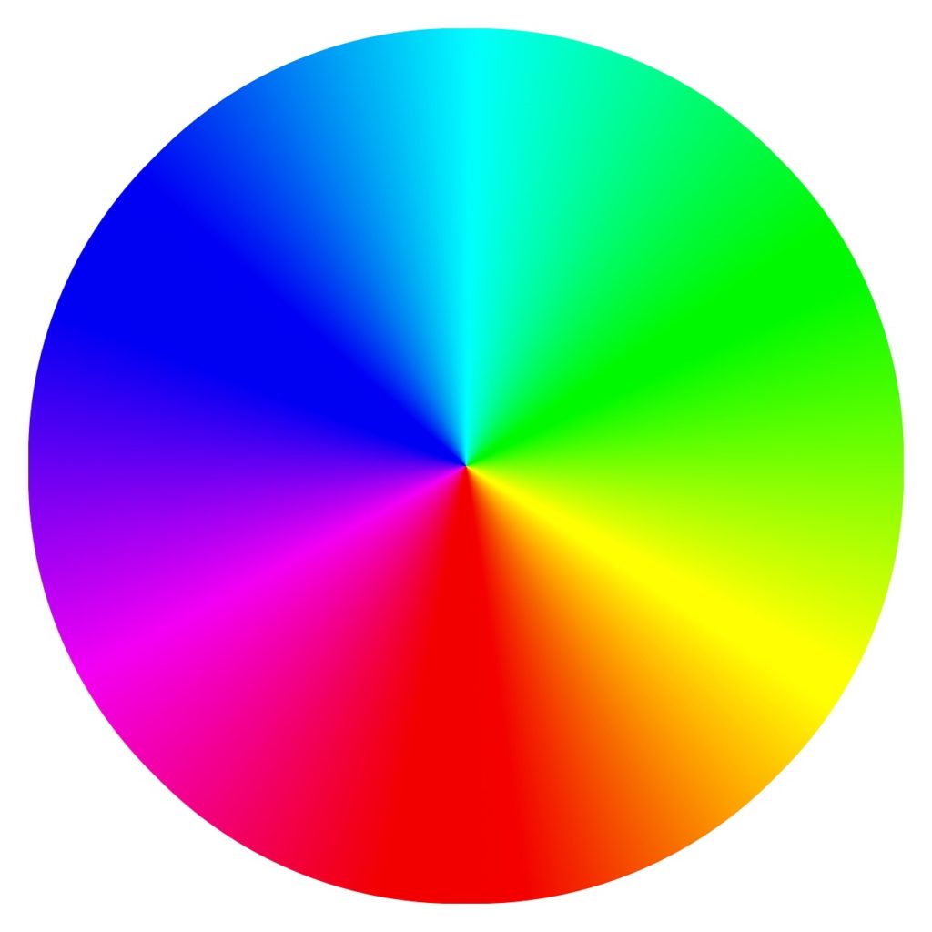
Primary colors: the primary colors are the, well, primary ones in the wheel. They’re typically the most noticeable and notable, so seeing them on clothes kind of makes you like a fire truck. The three primary colors of the wheel are red, blue, and yellow. Keep in mind that Primary colors should be used sparingly due to their harshness on the eyes; having too many of them in one outfit can look heavily saturated like a clown had puked on you.
Secondary colors: the secondary colors of the wheel include orange, green, and violet. If you’re just getting the hang of fashion, these are going to be your best friend. Easy to work with outfits and softer on the eyes, these are going to be your best friend when trying to make your outfits look nicer.
Tertiary: these are all the colors in between the secondary colors, they’re more subtle than the secondary colors and are even more obscure in hue, so there’s a limitless amount of these.
Complementary colors: this is the fundamental color pairing. It’s also the easiest, so typically you’d start with this. Here’s how it works.
- Pick a color on the wheel.
- Pick the color directly opposite of it.
- For instance, red and green are complementary.
- Wear these and they should compliment one another.
Note that you should be careful with using this. Direct complementary colors “technically” work well with one another, but it’s very easy for them to be too hard on the eyes.
The Best Color Scheme for Men’s Fashion: Split Complementary
The best way to avoid complementary colors’s hardness on the eyes is to simply use split complementary colors. Here’s how it works.
- Pick a color on the wheel.
- Pick the color directly opposite of it.
- Select the two colors right next to the one directly opposite of the color you originally chose in step one.
- Wear these and they should make a split complement.
For example, the split complementary of orange is violet and green. To make it look even nicer, use more tertiary colors to pair with your complementary colors.
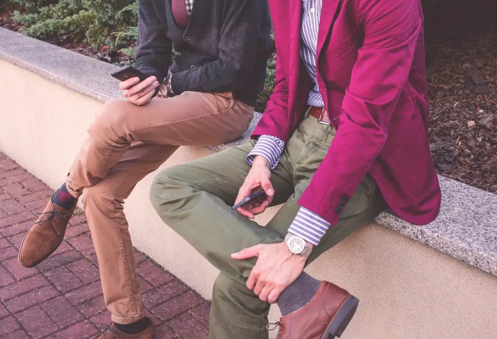
Remember that the general rule of color schemes in men’s fashion is to have a balance of forces. Grey pants can tone down the loudness of any strong and vibrant color.
Black and White Clothes on Men
Black and white typically always works on any outfit. It’s usually like this: White shoes, black stretch jeans, white shirt, black cardigan. Of course, this can make the outfit look “matchy matchy” and this gives the illusion that the color scheme is “childish”, but technically, it works. Another problem is that black and white clothes can be “tense”. You want to avoid this tension because tense color combinations like black and white can make you look tense too! The last thing you want your outfit to do is make you look like you’re flexing every single muscle in your body because you can’t stand social interaction!
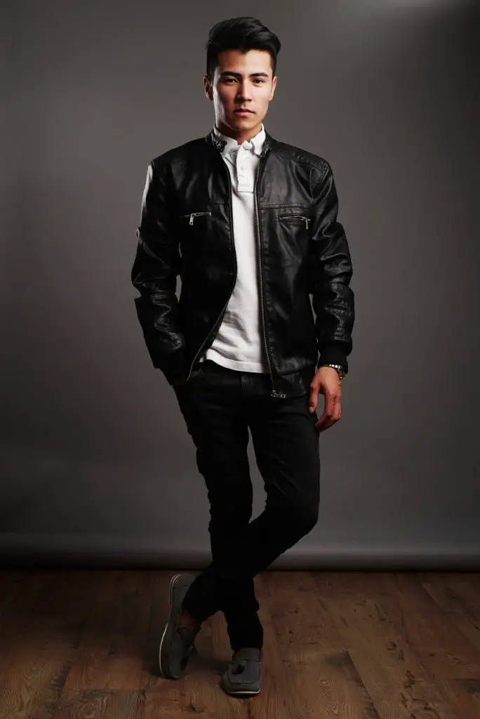
I’d recommend the only black and white combination you make be a white casual button shirt, white shoes (don’t worry, they’re cheaper than Common Projects), and black pants. Remember to give it some decoration so you don’t look like some stone wall.
Just, y’know, make sure they’re white casual shoes and not the clunky dad ones, unless that’s what you’re going for.
This outfit typically goes well with an olive jacket like a slim bomber or a parka jacket. Just remember to never be afraid of changing things up with your wardrobe or making mistakes, lest you become every other basic asian bro. Unless, again, that’s what you’re looking for!
Oh, also, don’t wear a black suit. The only time you would wear a black suit is if you’re from a movie or if you’re in a funeral.
Colors For Your Body Type
The one thing to keep in mind is that white makes you look bigger than you actually are. So if you could do with cutting down a few pounds, adapting a keto diet, or are too scared of looking even slightly larger than normal, then avoid white whenever you can. Black on the other hand makes your body look slimmer. So, if that’s what you’re into, you can make your silhouette slimmer and fitter by wearing more black.
Speaking of wearing black, be careful of the hype you hear in the fashion community.
There’s a joke in the fashion community that you never shop at Gap, and as a result, never Banana Republic, because one has to “Be better than The Gap.” It was inspired by a movie starring Ryan Gosling, where he takes an unfashionable train wreck to sort out his closet. While that’s mostly true, and most stuff in the Gap is atrocious, here’s something Ryan Gosling got wrong: Banana Republic, which is practically the same as the Gap but with different companies, actually makes decently good Fine Merino wool black sweaters.
Yeah, literally. If your range is 30-100 per sweater, stick to the Merino wool sweaters from Banana Republic. They’re actually good; everything else, well, Ryan Gosling was right about everything else…

Remember to have colors that work with your skin type. Try not to wear colors that resemble or are very close to the skin tone you have. This can, in some very weird way, make your outfit look like it’s blending into your naked body. Yeah, that’s kind of a weird way of putting it, but you’ll get what we mean when you see it.
So for example, don’t wear light brown or tan clothing when your skin tone is light brown or tan: you’ll look like your outfit is merging with your skin. Try to have something that contrasts with your skin tone like a more rich and dark navy blue blazer. Yeah, okay, you’ll look like any other upper-middle class gay guy from New York, but those guys look nice!

If you have a very, very dark skin tone, try to avoid very dark colors in clothing and make the primary colors work in your favor. The saturated colors will stand out and you won’t have to worry about looking like a clown puked on you!

Color Scheme Samples
You can find some of the best color schemes made for you with this site right here. It’s usually best to use something like Pastel colors and Earthy colors in your outfits. Just make sure to separate them so that they don’t look like they’re at war with one another. One outfit for earth tones, another for Pastel colors. We also have a selection of colors that we thought to be the safest colors to work with in your outfit. You can’t screw up with these!
Safe colors
Olive
Wine
Navy
White
Dark-Orange (in small amounts)
Dark Red,
Black (Not in Suits)
One last thing. This goes for all of our articles, but these are general rules. The only time you would follow our rules without breaking a single one is if you haven’t ever looked into color schemes for men’s fashion in your life. Follow these rules for a good foundation, but remember not to be afraid of getting out of your comfort zone. Have fun with it too! That’s the reason why people can continue to make their outfits look amazing: they’re not torturing themselves to make things perfect; they’re improving their outfits but also having fun with it!
Got other burning questions about color schemes for men’s fashion? Want to improve your outfits make heads turn? Have a chat with us! Don’t worry, we’re not the snobby fashion types! (sometimes!)